It’s been some time since the last post! Classes picked up and we’re in the prime selling season at office, so I let the blog simmer. The below is the write up for one of my courses this past semester - Information Visualization. Images come from the awesome article by Hafsa Jabeen on basket analysis. You can find the associated shiny app here. Setting this up is deserving of its own write up, so I’ll get to it another time. Enjoy.
ABSTRACT
Items are often purchased together. At a pub in England, if someone gets a pint without a full dinner, it’s a safe assumption that this person will purchase chips [1]. If one sees a shopper at the supermarket with eggs, there is a good chance they’ve also got milk in their cart. These associations, based on the natural order of items purchased together, are the reason why peanut butter is on the shelf next to the jelly. Until the age of storing granular transactional data, these rules were exploited at relatively obvious, almost anecdotal levels. This phenomenon may very well lead to the familiar sections in stores – home & garden, canned beverages, electronics. They are primarily a convenient form of organization, but also help drive a business to sell more. Network visualization offers an efficient way to see relationships between entities. Tables of relationships hold communities, magnitude of networks, hermits, and super nodes that can be simultaneously expressed using a graph. Pairing network graphs with basket analysis offers a natural view into purchase associations.
We explored wholesale footwear purchasing over 4 months, and used the apriori algorithm available in the arules package in R. The method saves computation power by not exploring every possible combination of products, with the added benefit of efficiently removing infrequent item sets [2]. For deployment, we built an interactive Shiny app, allowing the user to tune the model parameters and chose what product groupings to see.
INTRODUCTION
In order to gain the insight that peanut butter and jelly, milk and eggs, or sliced bread and cold cuts go together at a more efficient scale, we can use large datasets of transactions and find rules via Association Mining [2]. From this practice, we walk away with a set of rules in an if-then structure. If this item is purchased, then we feel pretty good that the next item was part of the transaction, too.

It’s important to note that any number of items can lead to another. For example, swimming trunks AND a tank top can have a strong association with sunscreen. We looked at wholesale Chaco Footwear sales for the Spring 2019 season. The data started at ~100 thousand rows for our business-to-business, or B2B sales. Said differently, we looked at product purchased by retail partners for their own stores. The purchase groups landed in 2 timeframes – preseason and in-season for Spring 2019, all at a daily cadence. To decrease noise, orders were combined at monthly intervals. Rule development used minimum support, confidence, and lift levels. With the many rules that were possible, interactive dashboard provided an avenue of exploration that allows users to see various product collections, rankings of rules by different metrics, and a tuning board for the algorithm.
METHODS
Data Collection and Consolidation
The data was retrieved using the internal Business Warehouse, an add-on purchased by WWW to support the day to day SAP business tasks. The data comes in two main parts:
Preseason orders. This represents everything on order the day before shipments begin. This represents wholesale buyer’s anticipation of popular products.
Inseason orders. This accounts for reactions to the business while the product sits on the shelf. The BW interface is built into Excel and yields spreadsheet outputs. The data sets were read into R using the readxl package, a member of the tidyverse. The data needed to be grouped into largest buckets to handle a 2 main sources of noise:
- Wholesale buying is a major business function with full corporate hierarchies and specializations. In soft goods, it is common for an individual to handle purchasing for women or men product only, overstating the association between products handled by a single buyer.
With the many moving parts of purchasing, mistakes are made and often need to get corrected. Over 3 days, items can show up as ordered, get adjusted away, and then added on at a new price. Grouping by month smooths these processes out.
Basket Analysis needs a unique ID to differentiate items purchased together. Because we combined items at a month level, we could not use the system generated order number. To compensate, a key was generated using the customer number, sales territory key, and month represented numerically. Dollars and units were left out of the analysis. The cleaned table consisted of two columns – the unique ID and the product Stock Keeping Unit, or SKU. The table was written to a local .CSV file.
Association Mining
This step used the arules package initially written in 2011 [3]. It uses a C implementation of the main apriori and eclat algorithms. The written .CSV file was read back in using the arules::read.transactions function. With the data being in the 2 column form with unique cart ID and product Stock Keeping Unit (SKU) code, the format needed to be set at “single”.
transactions <- arules::read.transactions("orders.csv",
                                          format = "single",
                                          sep = ",",
                                          header = TRUE,
                                          cols = c(1, 2),
                                          quote = "")
The transaction object transactions is then fed into the apriori function, which takes parameters for support, confidence, and the max length of rule antecedents.
order_rules <- arules::apriori(transactions,
parameter = list(supp=0.01,
conf=0.8,
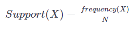
maxlen=5))Support and Confidence are the backbone of the mining process and they consist of probability formulas [2]. Support represents the ratio of transactions that contain an item set to the total transactions. So, with an item set X in a data set of N transactions,
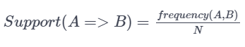
With an association rule A -> B,
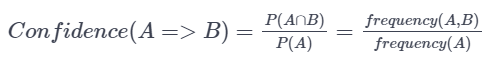
Confidence represents the ratio between transactions that contain an item set to transactions that contain only 1 of the items. Said in probability terms, given item A is in your cart, what is the probability of purchasing item B?
Generating association rules can be computationally expensive because it is a full look of a database. A rule is generated for each item set, which can become a combinatorial nightmare [1]. To prune the number of rules presented, minimum support and confidence levels are set. To further decrease the number of total calculations, the apriori algorithm is used. It states that any subset of a frequent itemset must also be frequent. Said another way, if an itemset is found to be infrequent, meaning it fails the minimum support or confidence levels provided, no set consisting of that item will be tested [2].
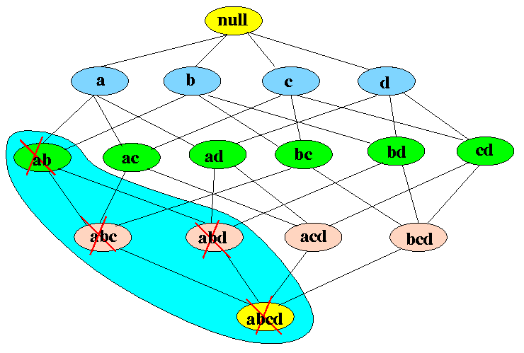
In the above image, item set AB was found to be infrequent. This leads to every upstream item set containing A and B – ABC, ABD, ABCD - to be excluded from the analysis.
After selecting for top rules based on either support, confidence or lift, the resulting graph is converted into an igraph object and passed to the VisNetwork package.
# Take top rules by support
top_rules <- head(order_rules, n = 15, by = "support")

#  Create graph object
top_plot <- plot(top_rules, method="graph", control=list(type="items"))

# Set as igraph object
ig_df <- igraph::get.data.frame(top_plot, what = "both")

visNetwork(
  nodes = data.frame(
    id = ig_df$vertices$name,
    value = ig_df$vertices$confidence, # could change to lift or confidence
    title = if_else(ig_df$vertices$label == "",ig_df$vertices$name, ig_df$vertices$label),
    color.background = if_else(ig_df$vertices$label == "", "red", "lightblue"),
    shape = if_else(ig_df$vertices$label == "", "diamond", "dot"),
    ig_df$vertices),
  edges = ig_df$edges) %>%
  visEdges( arrows = "to" ) %>%
  visOptions( highlightNearest = T )
Various attributes of the graph are set up in this step including labels, node shapes, images, and graph options. In addition to our product SKUs, the association rules are represented as nodes. This assists in handling relationships where multiple products make a set that indicate another item.
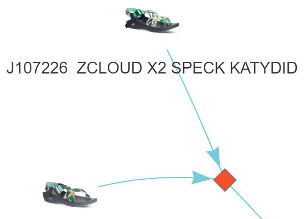
In the above graph, we see our product nodes represented as the shoe image with the association rule shown as an orange diamond.
FOLDING INTO A SHINY APP
The shiny package allowed us to provide an interactive dashboard where any user can modify algorithm parameters and see alternative outcomes.
# Define UI
ui <- fluidPage(theme = "style.css",
    # Application title
    titlePanel(h3("Chaco - Wholesale Basket Analysis")),
    # Sidebar with a inputs
    sidebarLayout(
        sidebarPanel(
            sliderInput("rules",
                        "Select Number of Associations to Show",
                        min = 5,
                        max = 25,
                        value = 10),
            h5("Associations represented with orange diamonds"),
            radioButtons("ranker",
                         "Select Metric to Sort Associations:",
                         choices = list("support", "confidence", "lift")),
            selectInput("product_mix",
                        "Select Product Mix to Display:",
                        choices = list("Men's & Women's",
                                       "Kids",
                                       "Accessories",
                                       "Total"),
                        selected = "Men's & Women's"),
            h4("Tune Apriori Algorithm Parameters:"),
            sliderInput("support",
                        "Support:",
                        min = 0.01,
                        max = 0.10,
                        value = .01,
                        step = .01),
            h5("Support Item1 => Item2"),
            h5("ratio of transactions with Item1+Item2 to total transactions"),
            h5(""),
            sliderInput("confidence",
                        "Confidence:",
                        min = .7,
                        max = 1,
                        value = .8,
                        step = .1),
            h5("Confidence Item1 => Item2"),
            h5("ratio of transactions with Item1+Item2 to transactions with item1 only")

        ),

        # Show a plot of the generated distribution
        mainPanel(
            visNetworkOutput("network_graph", height = "600px")
        )
    )
)
The server function was carried all of the code in a RenderVisNetwork function to capture all reactive elements. The reran the network code everytime new attributes were provided.
server <- function(input, output) {
    output$network_graph <- renderVisNetwork({

        orders <- read_feather("orders.feather")

        #Set genders based on input from user
        genders <- case_when(input$product_mix == "Men's & Women's" ~ c("Men's", "Women's","","",""),
                             input$product_mix == "Kids" ~ c("KIDS","","","",""),
                             input$product_mix == "Accessories" ~ c("NEC", "Unisex","","",""),
                             input$product_mix == "Total" ~ c("Men's", "Women's", "KIDS", "NEC", "Unisex"))

        # filter orders and write as .csv to be picked up by read.transactions
        orders %>%
            filter(gender %in% genders) %>%
            select(id, desc) %>%
            write_csv("orders.csv")


        tr <- arules::read.transactions("orders.csv",
                                        format = "single",
                                        sep = ",",
                                        header = TRUE, cols = c(1, 2),
                                        quote ="")
        # support, conf, maxlen as options
        order_rules <- arules::apriori(tr,
                                       parameter = list(supp=input$support,
                                                        conf=as.double(input$confidence),
                                                        maxlen=5))
        # n, by as an option
        top_rules <- head(order_rules, n = input$rules, by = input$ranker)

        # place into an ig item to pass off to igraph package
        top_plot <- plot(top_rules, method="graph", control=list(type="items"))
        # cleaning up attributes
        labels <- vertex_attr(top_plot)$label
        top_plot <- set_vertex_attr(top_plot, "gender",
                                    value = str_extract(labels, "Women's|Men's|KIDS"))
        top_plot <- set_vertex_attr(top_plot, "label",
                                    value = str_replace(labels, "Women's|Men's|KIDS", ""))
        top_plot <- set_vertex_attr(top_plot, "image_src",
                                    value = paste0("http://apphub.wwwinc.com/images/getProductImage/",
                                        str_extract(labels, "^(?:J|JC|JCH)[0-9]{6}"),
                                        "?type=2&size=250"))


        # Set as dataframe for easier extraction to visNetwork
        ig_df <- get.data.frame(top_plot, what = "both")

        visNetwork(
            nodes = data.frame(
                id = ig_df$vertices$name,
                value = ig_df$vertices$lift, # could change to lift or confidence
                title = if_else(ig_df$vertices$label == "",ig_df$vertices$name, ig_df$vertices$label),
                color.background = if_else(ig_df$vertices$label == "", "#F65024", "lightblue"),
                shape = if_else(ig_df$vertices$label == "", "diamond", "image"),
                ig_df$vertices,
                image = ig_df$vertices$image_src,
                mass = 3),
            edges = ig_df$edges) %>%
            visEdges( arrows = "to", color = "#76CCDC" ) %>%
            visOptions( highlightNearest = T )
    })
}
RESULTS
The resulting Shiny app offers an ability to explore the rules, instead of seeing them all printed in a table or showing up as a bowl of spaghetti on the screen. Touching on Schneiderman’s mantra, the user can see the full graph, zoom in on specific portions, and find specific data by clicking on the nodes. The user is also able to generate new graphs using various levels that control the number of associations to show and how they are ranked, categories of product, and parameters to tune.
An interesting outcome was discovered with respect to the style ZCloud X in Askew Angora. It is ranked 7th overall in terms of revenue, but is consistently in the middle of this network graph. Though not the strongest monetary performer, this style still consistently appears in shopping carts and can support most of the core functions at the brand. Sales can push this as a crowd pleaser – the type of style that will be seen in almost any store. Our partners would not want to miss the boat on this. Marketing can place the style in more content. If we know it’s typically in a cart, images & videos can be more relevant. Product can investigate and see what these associated styles have in common. Why is this particular assortment resonating with our buyers?
NEXT STEPS
We hope to find gather more data points as the season progresses. Because of the constant turn over of product colors (linked to SKU) each year, it is difficult to follow styles over multiple seasons. A solution is to report on silhouettes, which more-or-less stays constant through the years.
REFERENCES
“Market Basket Analysis.” Data Mining: Market Basket Analysis, www.albionresearch.com/data_mining/market_basket.php.
Jabeen, Hafsa. “Market Basket Analysis Using R.” DataCamp Community, DataCamp, 21 Aug. 2018, www.datacamp.com/community/tutorials/market-basket-analysis-r.
Michael Hahsler, Christian Buchta, Bettina Gruen and Kurt Hornik (2019). arules: Mining Association Rules and Frequent Itemsets. R package version 1.6-3. https://CRAN.R-project.org/package=arules